Centre-du-Québec
Chaudière-Appalaches
Eastern Townships
Lac Saint-Jean
Lanaudière
Montérégie
Montreal
North Shore
Outaouais
Centre-du-Québec
Eastern Townships
Lac Saint-Jean
Lanaudière
Montérégie
Outaouais
Centre-du-Québec
Chaudière-Appalaches
Eastern Townships
Lac Saint-Jean
Lanaudière
Montérégie
Montreal
North Shore
Outaouais
Back to articles
What Colour is Your Mood?
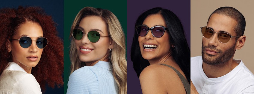
In home décor as in fashion, colour is making a comeback! What better way to bring more colour into our daily lives throughout the summer season that with a new pair of glasses? Keeping this in mind, 4 colours of TransitionsTM lenses were developed: Sapphire, Amber, Emerald and Amethyst.
Beyond self-affirmation, colour has a real psychological influence on us and on our mood.
Let’s take a closer look at these colours and their completely different messages!
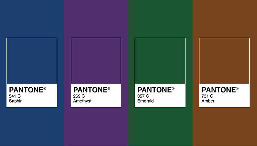
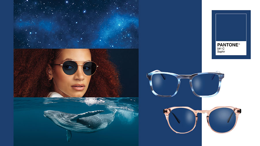
Are you in a calm mood?
SAPHIRE : CALMING BLUE
This wonderful hue can reduce anxiety and provide an elevated feeling of serenity. A reassuring and not overly stimulating colour, blue helps with concentrating and retaining information.
People who prefer blue are generally trustworthy and very sensitive to the needs of others. They have great intuition and patience and think before they act. Achieving perfection is essential for many.
Appreciated by a large part of the world's population for its positive associations with the sky and ocean, blue is compatible with several colours. For a perfect symbiosis with TransitionsTM sapphire-coloured lenses, black or blue tortoise acetate or silver tone metal frames are inevitable choices. For more contrast, transparent, beige or pink acetate frames are great alternatives.
Feel the calm of blue with TransitionsTM sapphire-coloured lenses!
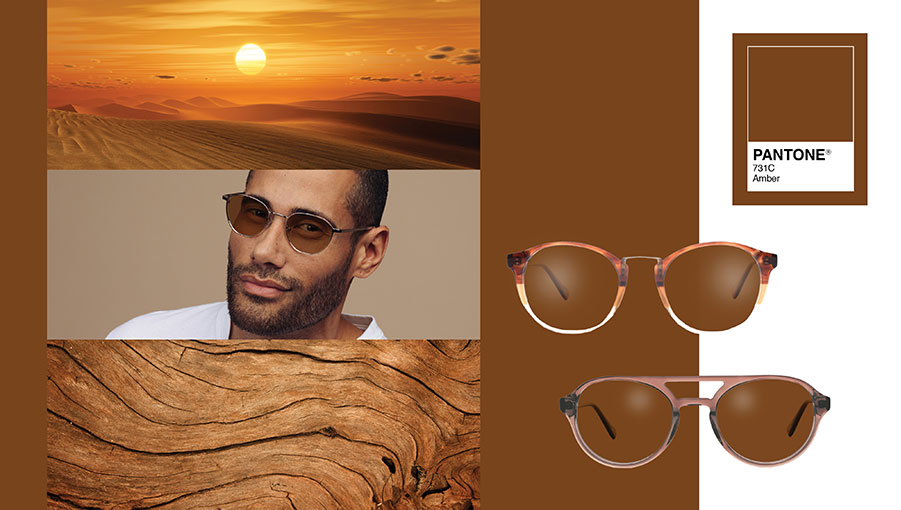
Are you in a stable mood?
AMBER: COMFORTING BROWN MEETS THE WARMTH ORANGE
A reassuring colour, amber has the ability to ground us and bring stability. This brownish hue is often perceived as down-to-earth but with a bit of a luxurious side (as brown is often associated with life's pleasures such as coffee, cognac, chocolate, wood and leather).
People who prefer amber are often responsible people with a strong sense of fairness. They appreciate routine, simplicity and stability. Losing control is generally not something they enjoy. Ubiquitous in nature, amber goes with absolutely everything. It couldn't be easier to match the perfect frame with this timeless TransitionsTM lens colour. The orange reflection of the lenses will also bring you tone and a bit of an energy boost. For perfect harmony with TransitionsTM amber lenses, neutral coloured frames such as beige or brown are strongly recommended. For a more vintage look, opt for vibrant coloured frames.
Feel the comfort of brown and the warmth of orange with TransitionsTM amber-coloured lenses!
Are you in a zen mood?
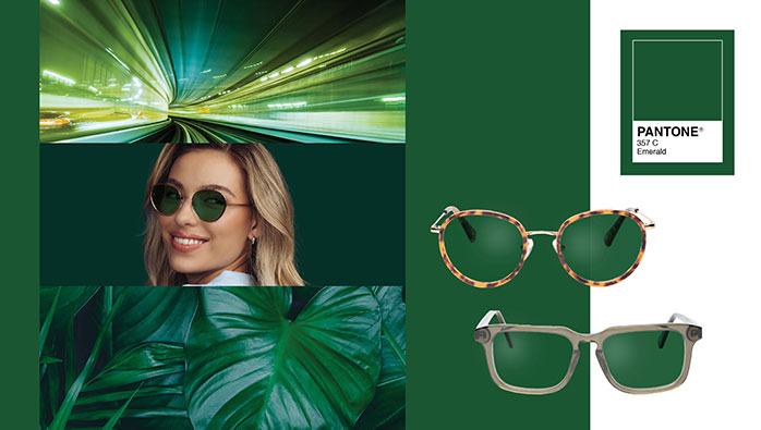
EMERALD: BALANCED GREEN
Green is blessed with almost mystical powers: it can make time appear to move more quickly and help us take deeper breaths, thus feeling Zen. Less waiting, less stress! Green is also one of the best colours for productivity and mental regeneration. We spend our lives trying to achieve balance, and green can help us reach this goal.
People who prefer green are generally loyal, committed, involved, responsible, intelligent and admired by their peers.
Some say green is a cool colour. But with a wavelength that sits in the middle of the rainbow, it's, in fact, the most balanced colour of all. Its ubiquity in nature and balanced wavelength make it a more neutral colour that's at once versatile and traditional. Its versatility is unmatched, making matching frame options nearly endless! For perfect harmony with TransitionsTM emerald-coloured lenses, tortoise frames are recommended. For a punchier look, transparent or red frames are a good choice.
Feel the balance of green with TransitionsTM emerald-coloured lenses!
Are you in a creative mood?
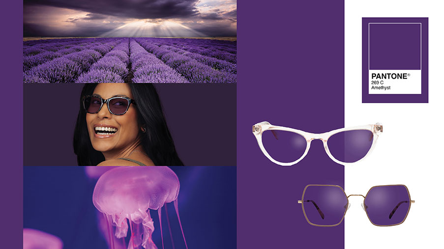
AMETHYST: THE ECCENTRICITY OF PURPLE
The word amethyst comes from the Greek word amethustos which means “not drunk” and therefore sober. Since its discovery, the amethyst stone has been associated with protection, especially by the Vikings who drank their alcohol in amethyst cups so as not to be inebriated!
It is therefore natural that purple has retained a certain aura of protection, magic and mystery. Looking at this colour or seeing the world in this colour through transition lenses can lead to a little introspection. Purple is also known as one of the best colours to encourage deep meditation.
Normally preferred by artists, spiritual people or those who consider themselves out of the ordinary, purple has long been reserved for royalty as it was not very accessible and laborious to produce. People who prefer purple are said to be easy to talk to and seem easy to know, but on the contrary, most of them keep a side of their life private and are rather difficult to really identify. This duality in them is represented by the duality in the composition of purple, which is a combination of red, the most active and stimulating colour, and blue, the most passive and calm colour.
To stand out from the crowd, there’s nothing like our purple TransitionsTM lenses. Perhaps they will stimulate your creativity!
All in all, each colour offers you a gateway to a completely different parallel world. More than just a simple choice based on your favourite colour, the type of mood you are looking for should be your guide in selecting the colour that will tint your most beautiful summer days.
What about you? What colour will you choose for your next TransitionsTM lenses?
Ask your OPTOPLUS eyecare professional about light intelligent TransitionsTM lenses!
All frame models in this article are branded Avenue Eyewear, discover the entire selection at avenueeyewear.ca.
Marie-Chantal Milette, Kryptonia Color Expert

